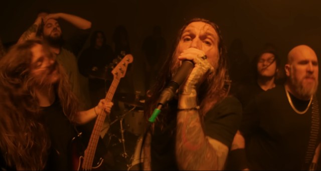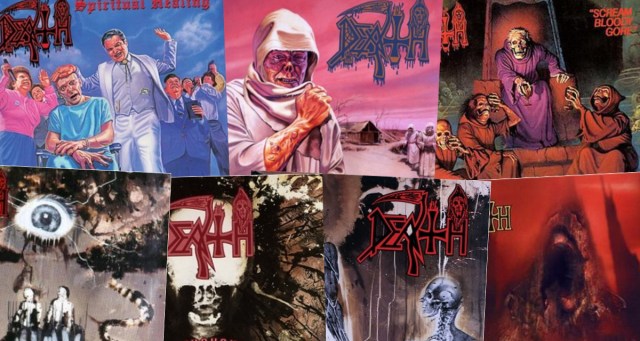
Death metal is only called death metal because it sounds like the kind of metal Chuck Schuldiner invented (at an age when most of us were still trying to nail the first few bars of the “Sweet Child O’ Mine riff), and his band was called Death. There’s being influential, and then there’s having a vibrant and multifaceted subgenre literally named after your band.
Not many thrashy metal bands that rose to prominence in the ‘80s can claim never to have dropped at least one complete and utter dud in their career (looking at you, Metallica, Megadeth, Slayer, and Morbid Angel). But Death made seven albums, and they’re all good. Sadly, this is probably due in part to Chuck’s untimely, well, death in 2001. Maybe he eventually would have had a “Reload” or a “Risk” or a “Diabolus in Musica” or an “Illud Divinum Insanus” to share with the world too. But as it stands, he created one of the all-time most formidable metal discographies in just over a decade. So this is going to be a hard ranking. RIP, Chuck.
7. Spiritual Healing (1990)
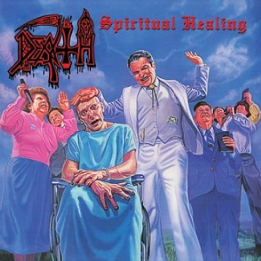 In a genre known for boundary-pushing album covers—Cannibal Corpse is only the tip of the iceberg on this—somehow this is among the most horrifying. What could be more grim than early ‘90s televangelism? The music is good, of course, with some especially killer drumwork, and an increased emphasis on melody, which, depending on what aspect of death metal you find most appealing, could be a good or bad thing. The riffing doesn’t seem quite as inspired or sinister as on the previous two albums, though admittedly, those albums were tough acts to follow. Also, there’s something weirdly off-putting about Chuck using a sexist slur on the opening track. We know, we know, it’s ridiculous to get prissy about mild profanity on a fucking death metal record, but it just comes off wrong.
Play it Again: “Spiritual Healing” and “Killing Spree” (side B is really where it’s at on this one)
Skip It: “Living Monstrosity”
6. Human (1991)
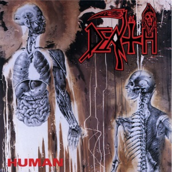 We’re pretty sure our readers are going to be cool with our bottom ranking, but we’re pretty sure we’re gonna get roasted on this one. This is a lot of people’s #1. It’s a perennial fan favorite. And it’s an important step toward Death becoming more technical and progressive, stylistic shifts that they’ll execute much more interestingly on subsequent albums. This one just doesn’t feel all that memorable or interesting by comparison. Darn good album? For sure. Top tier Death? Sorry, we just don’t see it.
Play it Again: “Flattening of Emotions” and “Together as One.” This time, Side A is where it’s at.
Skip It: The cover of Kiss’ “God of Thunder.” Yeah, this is kind of cheating, because it was only on the Japanese import and then the 20th anniversary Relapse reissue. But like most things pertaining to Kiss that aren’t called “Detroit Rock City,” it is just SO skippable.
5. Symbolic (1995)
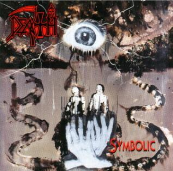 And the spicy takes continue. This is also a beloved Death album, but if we’re being honest with ourselves, aren’t they all? Is there a single one that doesn’t have its share of devotees ready to go to the mat for it? But then, isn’t that true of all art? Somewhere, there must be people who sincerely think “St. Anger” or “Illud Divinum Insanus” (yup, we’re gonna namecheck those trainwrecks twice) is the apex of artistic expression and audio engineering, right? What is art anyway, really, when you think about it? For that matter, what is art appreciation but the mere illusion that anything has an inherent aesthetic value at all? Have these ponderous questions sufficiently distracted you from the fact that we ranked “Symbolic” in the bottom half? Nope, guess not, y’all still look pretty pissed off. Shit.
Play it Again: “Zero Tolerance” and “Empty Words”
Skip It: “Perennial Quest” – those harmonized guitars are verging on hair metal
4. Scream Bloody Gore (1987)
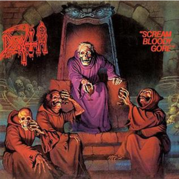 It’s the first Death studio album and also the first death metal album. Accept no substitutes. And if you’re a metalhead under the age of 50, just think of what a roundhouse kick to the face this album must have been if you’d been mainly listening to thrash and NWOBHM when you first picked this up. Surely, nothing could be heavier and/or more influential after the bar set by “Powerslave” and “Reign in Blood” and “Peace Sells” and “Master of Puppets” in the mid-’80s, right? Haha, nope, wrong. Pretend for a moment that you’re a 16-year-old kid who picked this thing up at your local record store on a whim: it starts off pleasantly enough, with a nice, slow groove to make you comfortable. Then Chuck comes in with the growling vocals and you’re like “OK, that’s different.” And then it just explodes into a whole new genre of music.
Play it Again: “Zombie Ritual” (that bass hook, omg) and “Denial of Life” and “Mutilation”
Skip It: “Regurgitated Guts”
3. The Sound of Perseverance (1998)
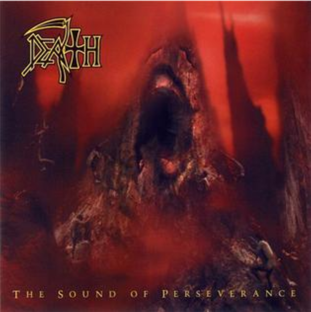 Do you like tempo shifts? Then this is probably your #1. “Sound of Perseverance” is Death’s most technical and prog-forward album, but the cool thing is that that doesn’t mean it sounds like Yes or King Crimson playing BC Rich guitars through a collection of HM-2 pedals, nor does it come across as wonky Gorgutsian theory-nerd stuff. There’s no barrier to entry on this in the way there is for a lot of bands’ more abstract and technical releases. This is just Death doing their thing: solid songwriting, in-your-face performance, and a rhythm section you could set your watch to. You can 100% dig it on that level. The musicianship here is top-notch, but in an understated and modest way, without the pretension and self-importance of metal at its techiest. Special acknowledgment must go to “Spirit Crusher,” a deceptively simple mid-tempo number in which Richard Christy nails one of the most weirdly inventive drum transitions imaginable.
Play It Again: “Spirit Crusher” and “Flesh and the Power it Holds”
Skip It: “Painkiller”—the Kiss cover on Human is worse, to be fair, but Judas Priest just did not need to be invoked here either. It’s fun to play and listen to covers, but it’s an unnecessary way to close out such an epic album.
2. Leprosy (1988)
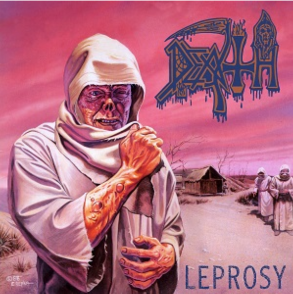 Released barely a year after the debut, it’s clear that with this album, Chuck & co. were bursting with ideas—not to mention an affinity for the kind of breakdowns that every deathcore band of the last ten years has homogenized into over-compressed sonic mush—and they channeled those ideas into this absolute monster of a death metal classic. Like a lot of the greats of the genre, their sophomore album pretty much leaves the thrash influence behind and fully embraces the burgeoning Floridian death metal/Morrisound aesthetic. Slightly more sophisticated than “Scream Bloody Gore” in terms of composition and production, but still so brutal and raw that it holds up with the heavyweights of the era like “Altars of Madness” and “Deicide.” When it comes to in-your-face aggression, those latter two might sound more evil and relentless, but “Leprosy” takes top honors for cohesiveness, an early step toward proggy technicality, and overall execution. Also, little known fact, it held the world record for “Pinkest Metal Album Art” for many years until it was finally beaten out by Deafheaven in 2013.
Play it Again: “Leprosy” and “Pull the Plug,” if we have to choose, but really all of it
Skip It: This is a tough one, but we’ll go with “Primitive Ways”
1. Individual Thought Patterns (1993)
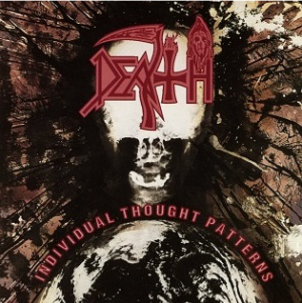 This one seems to fly under the radar sometimes, and we honestly think that might have something to do with the understated cover art. No dead-eyed lepers in a Mad Max wasteland or demonic mountaintops or “Tales from the Crypt”-style Halloween imagery or bug-eyed Evangelical lunatics committing elder abuse this time around. But never mind the album art (which is killer in its own right): this album is, to allude to a totally different sort of metal band, “more Human than Human.” Everything that made “Human” a triumph and a fan favorite—the flawless musicianship, the who’s-who-of-metal lineup, the jazz fusion flourishes, the stunning basswork, the thought-provoking lyrics—is even better on “Individual Thought Patterns.” Right out of the gate with album opener “Overactive Imagination,” this record goes from 0 to 100 in no time flat. This is basically Death’s “…and Justice for All.” It’s got a consistently satisfying “Harvester of Sorrow”-esque gallop, the lyrics are angry but poetic, the song structures are heavy as hell but deceptively intricate, and the bass could stand to be a tad higher in the mix. Oh, and like Justice, it’s the single best album in its band’s respective discography. We said what we said.
You could make a solid case for the other six Death albums being in literally any order (there are 720 different possibilities for that, if we’re remembering how to do factorials correctly from middle school math class, so go nuts), but we don’t see any world in which “Individual Thought Patterns” is NOT #1.
Play it Again: The first nine tracks, but especially the first two, “Overactive Imagination” and “In Human Form.” These are bangers of the highest order.
Skip it: Track 10, “The Philosopher.” Noted metal critics Beavis and Butthead mocked it pretty hard, and who are we to disagree with those two? (Actually, just kidding, we’re not taking music advice from someone in an AC/DC shirt, and this song also rips.)
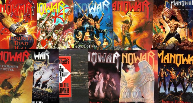
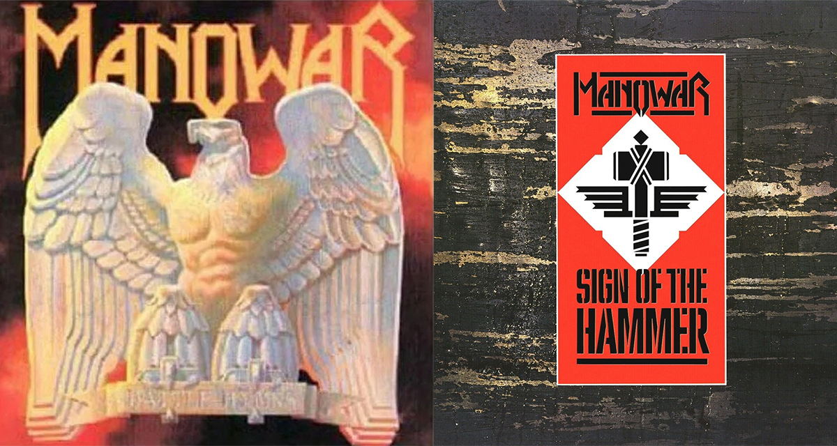 Can an album cover get less than zero? Because what the shit is this? I mean I sorta get it with “Battle Hymns” as it was their first album and they probably hadn’t learned that all anyone wants from this band is hot, sweaty beefcakes on the covers. But 4 albums in, there is no excuse for “Sign of the Hammer.” More like “Sign of the Not Gonna Listen to This Album Unless They Change the Art and Put a Hot Ass Dude Holding an Axe on There.”
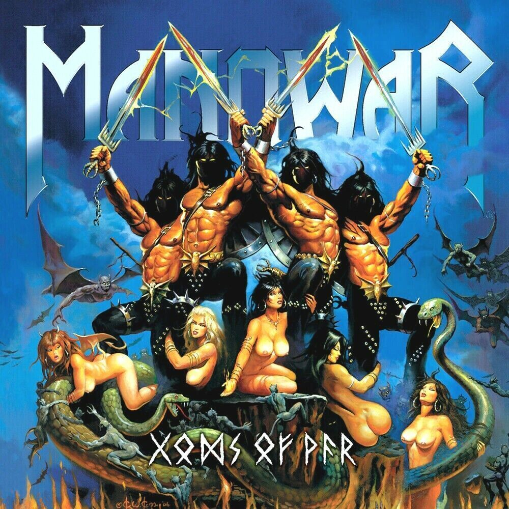 Now you might look at this cover and think “super ripped sweaty beefcakes and boobs?!?! How is this not number one?” But here’s the thing. If you’re gonna show nudity, show nudity. Boobs are great. We all love boobs. But why the hell are the dudes with swords wearing pants? We get that they’ve got those dope codpieces, but not one of them is hanging dong?!? Horseshit. At least let one testicle hang out of the side. And you know what’s the worst part? We guarantee there was a conversation about it. At least one guy in that band was like “why aren’t the sweaty beefcakes showing their dingle dangles?” And deep down everyone involved knew what should happen. But nobody stood up and did the right thing. And that’s how fascism takes power.
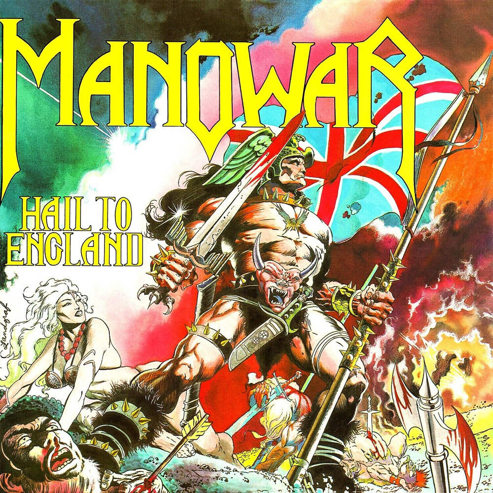 No. England gets no hails. We do like the sorta comic book style of the cover art and it’s definitely moving in the right direction, but still no. Manowar’s whole thing is being from New York and dressing like “Game of Thrones” Chippendales. We don’t need to bring Royal Family nonsense into it.
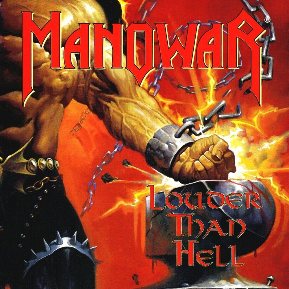 Teasing is great. We all love a tease, especially when the tease is this vascular. But we don’t like Manowar covers because of the tease. We want a full-on, hot sweaty beefcake. And while there is some of that, we’re just not seeing enough. Definitely appreciate that it’s a closer shot than usual, so we can get some beefcake details, otherwise known as beeftails. But other than that this cover is meh. Who knows? Maybe it folds out into a dope, hot, sweaty poster. But we’ll never know, because we’ve moved on to other albums.
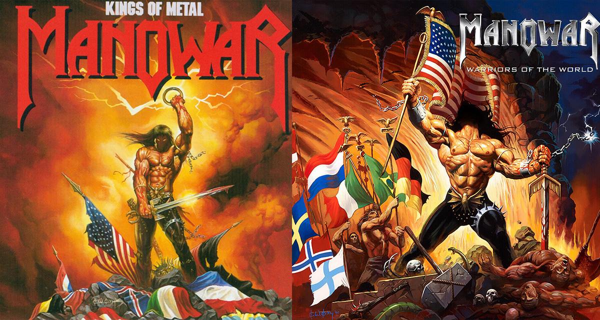 Both of these covers would be waaaaay cooler without the flag nonsense. Imagine seeing a hot sweaty beefcake in real life and thinking “Dope. That is a hot, sweaty beefcake, which I support.” And then they pull out a broad sword and you’re like “Hell yeah. Didn’t think this could get cooler, but then it did.” And then in the most non-Chad move of all time, they then pull out an American flag. Yikes. Nothing wrong with being from the States. Some might even say Hard Times is based in the States. But we don’t wanna have to be worrying about where this dude was on January 6. Keep your nationalism out of my hot sweaty beefcakes.
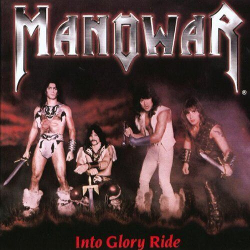 You know when your friend started referring to exercise as “gains”? That’s the whole vibe of this cover. Meanwhile there are no gains to be seen, despite the fact that it feels like they probably won’t shut the fuck up about it. And to be clear, we don’t body-shame at The Hard Times. But what the hell is this? We don’t want an actual photo of the band. We want greased up, hot, sweaty beefcakes, regardless of body-type. At least the dude on the left understood the assignment. Everyone else is giving off the vibe of that feeling when you thought something looked great in the store dressing room but now you gotta wear it to the dinner party and you realize it’s kinda ridiculous. Not the guy on the left though. When he bought his fur thunderoos, he knew exactly what he was getting into, and there is no way in hell he’s not showing them off.
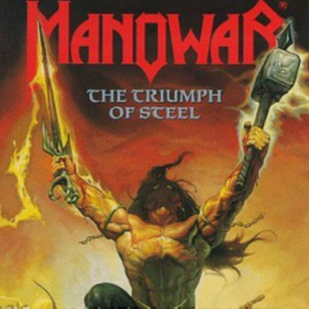 This would probably be number 2 if it wasn’t for the use of the word “triumph.” Just literally any other word not associated with the rise of fascism and all we’re focusing on is this fictional, faceless hot sweaty beefcake who thankfully has dropped his flag-waving nonsense from some of the other albums. Call this album “Gains of Steel” and we’re all in.
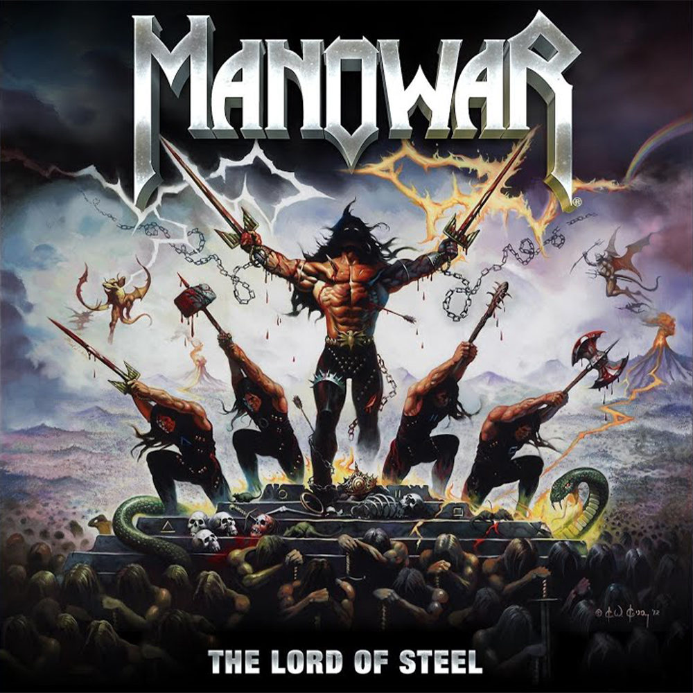 Here we go. This is getting good. This feels metal, without any of the weird vibes of some of the previous covers. And it’s scary metal. Dark and grim. There’s like a snake and a dragon-looking thing. But still, as always, hot, sweaty beefcakes. The sweatiest. And they have weapons. That’s probably the band surrounding the center beefcake, which is sorta cool. But it’d be a lot cooler if they were wearing less clothes. Not in an “objectification” but more in a “we’re here for the hot, sweaty beefcakes” way. Which we’re pretty sure is different.
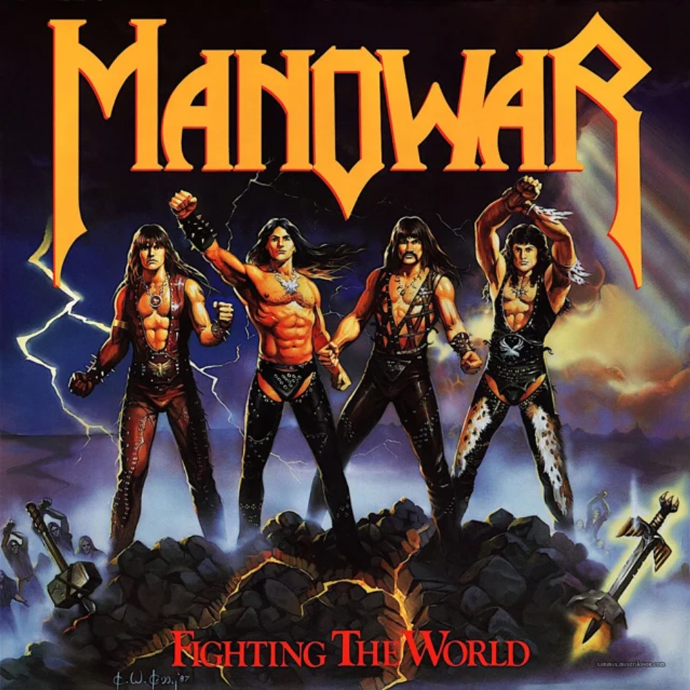 This. This is it. This is what we want. Before social media, it was very hard to see how someone else viewed themselves. Unless that someone else was Manowar. Because this album cover is exactly how they see themselves. Wish-fulfillment is kinda the whole Manowar thing. Which is another reason this cover works so well. It’s the actualization of everything Manowar is going for. It’s over-the-top, and seemingly not in a self-aware way. It’s four dudes paying an artist to paint them as the D&D warriors they always wanted to be and also maybe actually think they are. In chaps. Can we talk about the chaps? Because two of them are wearing chaps. That’s a real choice. And this is a painting. So there was time to see what the artist was doing and say “No, no. It’s absurd to be wearing chaps.” But instead these guys saw that and thought, “Goddamn I look awesome.” And that, in and of itself is in fact awesome. It’s “The Room” in an album cover. You don’t have to like anything about it to appreciate that what it is. Because what it is, is four hot, sweaty beefcakes.