
20. Wu-Tang Clan
You see this gold “W” and know exactly what it’s from. It’s just as recognizable as Leonardo da Vinci’s famous painting, only Leo’s doesn’t scream “Mona Lisa ain’t nothing to fuck with.”
19. Minor Threat

This one represents a black sheep running away from the herd and was illustrated by Cynthia Connolly. It debuted on their album “Out of Step.” On the album, the black sheep is actually done with crayon and the herd is watercolor, which makes it one of the few modern mixed media pieces worth looking at.
18. D.R.I.
The “Skankerman” logo kind of looks like a street sign that says “moshing strictly allowed.” Art is typically most effective when it gives you permission to fuck shit up in the pit.
17. Screeching Weasel
If you put the Screeching Weasel logo and the Mona Lisa side by side, they’re basically the same. Only one’s a cigarette-smoking woodland creature.
16. Germs
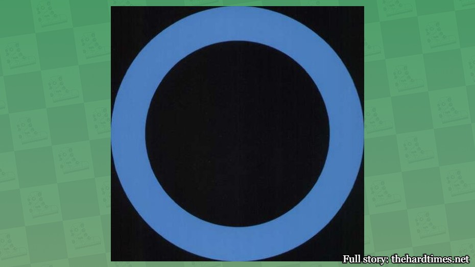
The Germs logo is minimalist but says a lot, which is more effective than art that has a lot of shit going on but doesn’t say anything. The circle is said to represent a cigarette burn that singer Darby Crash called the “Germs burn.” All that from one blue ring.
15. Bad Religion
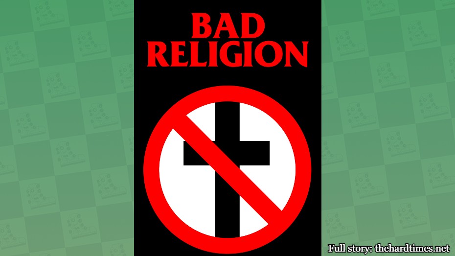
The “Crossbuster” was designed by guitarist Brett Gurewitz and it’s one of the more controversial band logos. But art is at its best when it’s making a statement. The Mona Lisa doesn’t have a single message in it. Not even an anti-authority one or anything. Total rip off.
14. Slayer

Nothing that Leonardo da Vinci ever painted inspired anyone to carve it into their arm. Slayer did though. The full logo has swords too. There’s only one sword in the Sistine Chapel and no one’s ever felt the need to engrave it into an appendage. Eat shit, Michelangelo.
13. Crass

At first look, the Crass logo is a mess. But it actually merges several other famous images into one, including the cross, UK flag, ouroboros (a serpent eating its own tail), and a swastika. I don’t understand what that’s supposed to mean, but art is not meant to be decipherable.
12. Nine Inch Nails

Trent Reznor taught us that letters can be art. This one is simple yet somehow visually appealing to the eye. The same can’t be said about that one mixed media on canvas you see for sale at every coffee shop for $400.
11. The Residents
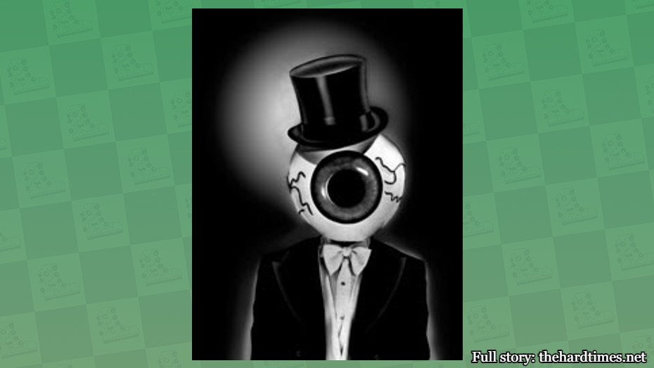
The Residents logo is simply a veiny eyeball donning a top hat and bowtie. This is not one of those pieces of art you’d see at a museum and just keep walking, unlike anything from Monet.
10. Motörhead
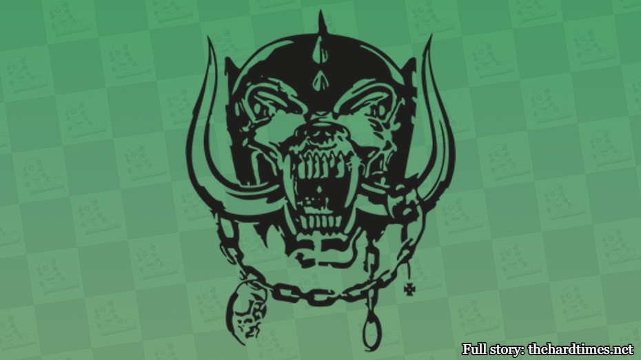
This one is called “Snaggletooth” and was created by artist Joe Petagno. Joe originally drew a combination of a gorilla and wolf-dog with colossal boars horns. Lemmy evidently added the helmet, chains, spikes, and saliva. Show me any photorealist artist that can make anything as life-like as this.
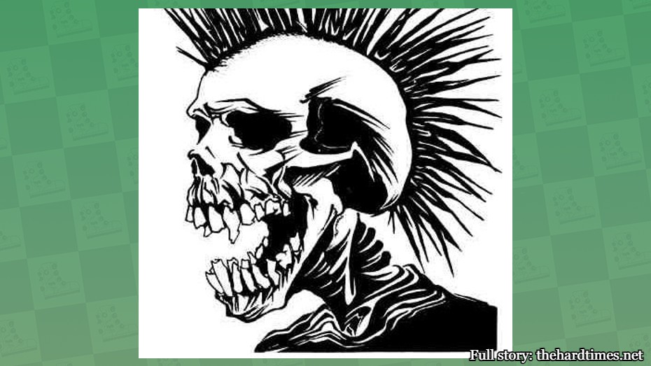
9. Samhain/Danzig
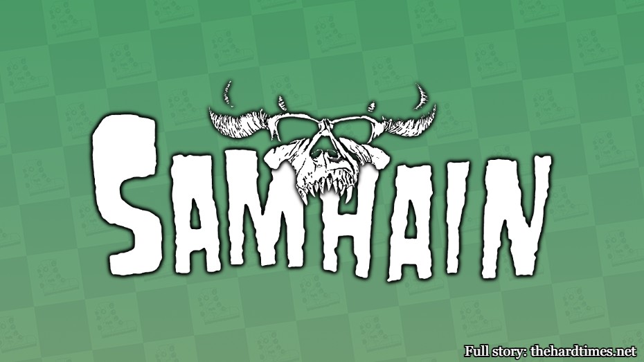
Sure, every third band uses a skull for their logo, but Danzig had to go one step further. It’s got cool horns, fangs, and high cheekbones, which means this skull was once hot. The lighting also appears to come from the bottom. That’s revolutionary for skull-based band logos.
8. Descendents
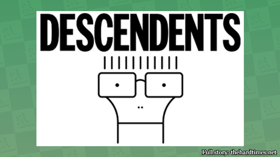
Sometimes you’re supposed to draw your own meaning from works of art. For instance, does that line on Milo’s face represent his chin or his mouth? Only the real artist knows this. Also, it’s a mouth.
7. Metallica

Singer James Hetfield evidently created this legendary wordmark. No one in the history of art ever made the letters “M” and “A” look cool. So yeah, when you think of the art greats, it’s usually Pablo Picasso, Vincent Van Gogh, and the guy the wrote “Master of Puppets.”
6. Circle Jerks

“Skank Kid” was created by California-based artist Shawn Kerri. Of all the skank-related logos, this one takes the cake. It’s so good that it could be printed on credit cards. You know, like how Van Gogh’s “The Starry Night” is on a 20% APR Visa Mastercard, just like he would’ve wanted.
5. The Exploited
Skull plus mohawk plus fucked up teeth equals one sick logo. If you saw this one at the Metropolitan Museum of Art, it’d be difficult not to shell out $45 for the poster version in the gift shop.
4. Ramones

Iconic means good. That’s what this one is all about. The logo is a spin on the US presidential seal, if you’re into art with a muse. Ramones were famous for selling more t-shirts than albums. Renaissance painters were notorious for not selling any albums whatsoever.
3. Dead Kennedys

You don’t have to travel all the way to France to see this one in person. Just walk into any high school classroom in the ’80s and you can see it scribbled on a punk kid’s notebook. Art is at its best when you can recreate a piece easily yourself (see that “Cool S” thing). Also, if you rotate this one 90 degrees it looks like a picnic table. Nothing happens when you rotate the Mona Lisa. Total bullshit.
2. Black Flag
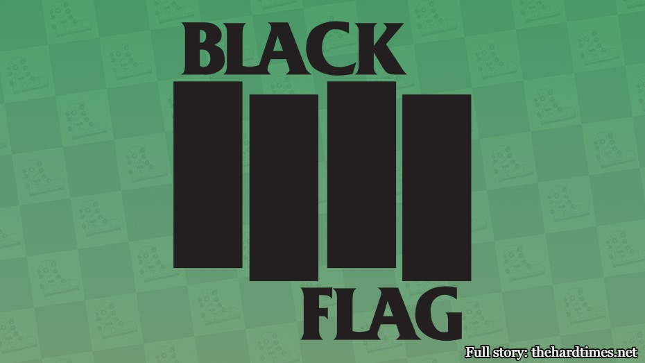
At first glance, this one is just a bunch of rectangles. But you know what? So is every Mark Rothko painting and that guy is famous for some reason. He shouldn’t be able to hog the field of shape-based art all to himself.
1. Misfits
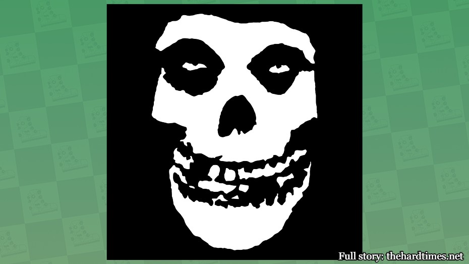
You’ve never seen a single person wearing a shirt with the image of Mona Lisa’s face, but about four or five times a day you see the Crimson Ghost skull on your commute to work. Now, if da Vinci painted a portrait of Mona Lisa’s skull, that might’ve been a different story.


