
Ever been to a museum and wonder, “Where is all the band-related stuff?” Sure, the Louvre has the Mona Lisa, but it doesn’t have the Descendents’ Milo guy. That can’t be right. That’s why we took it upon ourselves to rank 100 band logos by how much better they are than that one portrait by Leonardo da Vinci.
100. Phish
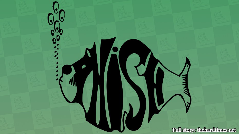
The Phish logo is a fish. Not terribly clever. But then again, the Mona Lisa is of someone named Lisa. You’ve got to be more creative with your art, guys.
99. Aphex Twin

You can look at Aphex Twin’s logo for hours and still not figure out what it’s supposed to be. That seems to be how art works, but at some point I want to see something sexually repressed.
98. Hatebreed
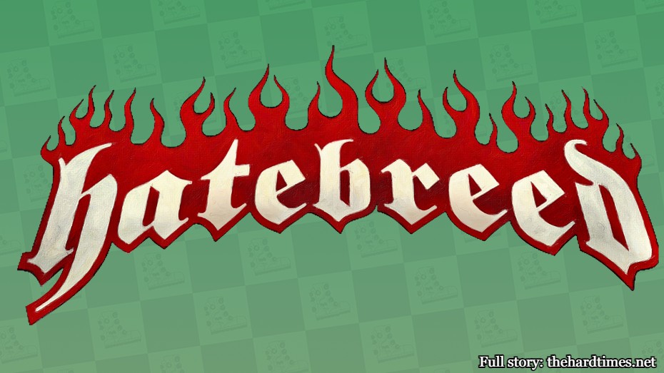
Hatebreed’s logo looks like it was designed by Guy Fieri’s shirt guy. Is that art? Technically. But is it good? Well, art is in the eye of the beholder. Also, no.
97. Sublime
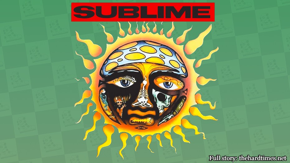
The Sublime sun guy kind of looks like collage art. It’s not for everyone, but at least collage artists tried something new by gluing pictures from different magazines together. Renaissance artists just conformed like normies.
96. Alkaline Trio

Hope you like skulls because you’re about to see a ton of them in this list. This one is just a sneak peek for the 50 more about to come up. There are better ones for sure, but this one is still one more cool skull than any Renaissance painting has.
95. The Who
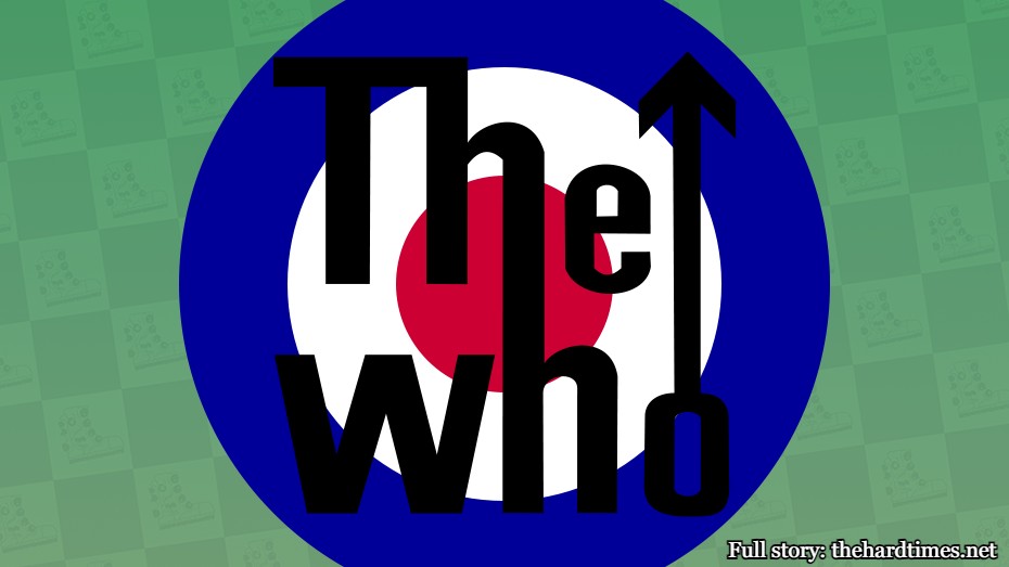
The Who logo probably looked cool in the ‘60s and ‘70s, but now the bullseye thing just reminds me of Target. Band logos should never make you think of “Live, Laugh, Love” wall decals.
94. MxPx

The MxPx kid was first drawn in 1994. Only a few years after the Renaissance period ended. Just missed the cutoff.
93. 7 Seconds
Many will tell you this logo is good. I guess it’s kind of like a Picasso. I don’t get what’s going on, but I’m glad someone does.
92. Blink-182
This logo seems to have been ripped off from the Nirvana smiley face one, which was ripped off from the “Have a Nice Day” smiley face. Most art is just copying and pasting. That’s why all Renaissance paintings look identical.
91. The Offspring

The flaming skull is yet another cranium-based logo. It’s not as cool as some of the others on this list, but this one is engulfed in flames. I don’t even think they had fire in the Renaissance. That might’ve been invented later.
90. Stray Cats
This looks like an image that would be in a tattoo menu book. That’s kind of cool. I’ve never once seen da Vinci’s “Adoration of Magi” as a tattoo option. Thankfully.
89. Foo Fighters
Using “FF” as your band logo can be quite confusing. I spent the first 10 years thinking this was Franz Ferdinand’s logo. All that said, it’s difficult to tell most Renaissance paintings apart. And Dave Grohl isn’t a part of any of them.
88. Gulch
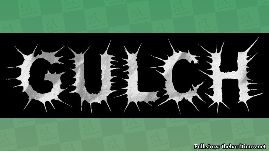
Renaissance artists merely recreated the subject they were painting to a tee. That’s boring. On the other hand, I’ve seen the word “gulch” every single day of my life, but have never seen it portrayed like this. Bravo.
87. Anal Cunt
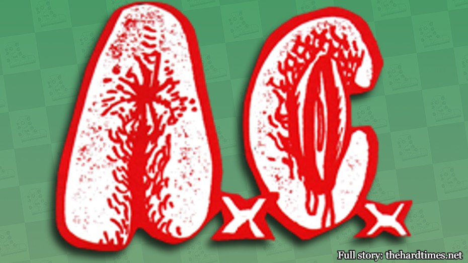
This one gets points for creativity, but also gets negative points for making me look at it. Same goes for the Mona Lisa.
86. Party Cannon
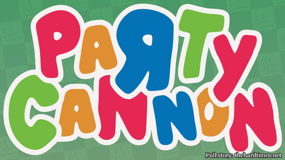
Art is all about tricking people. When you look at Party Cannon’s logo, you might think of Toys “R” Us, Party City, or the Wiggles. You wouldn’t expect a brutal death metal band. But sometimes artists need to go against the grain. Leonardo could never.
85. Opeth
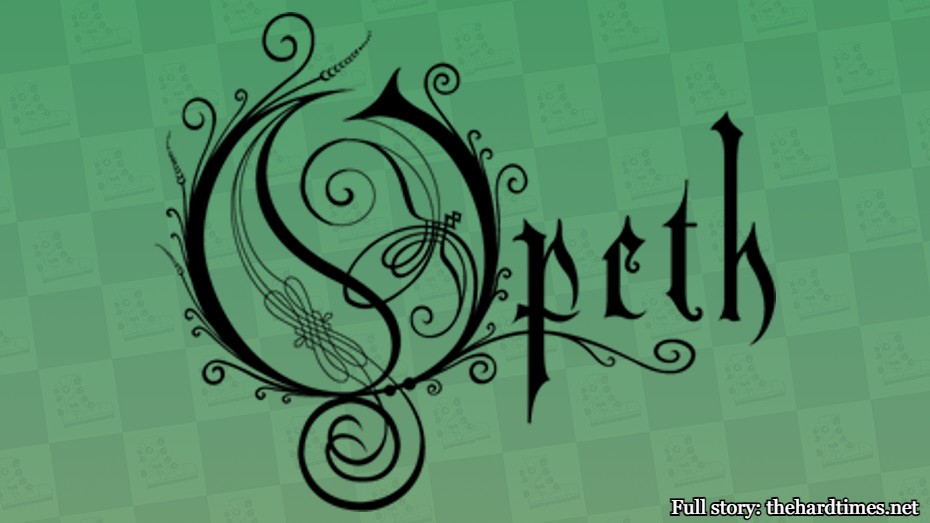
The “O” in Opeth is doing a lot of the heavy lifting in this logo. It’s like they fit an entire scene within the 15th letter of the alphabet. There’s almost nothing going on of interest in the Mona Lisa.
84. Alexisonfire
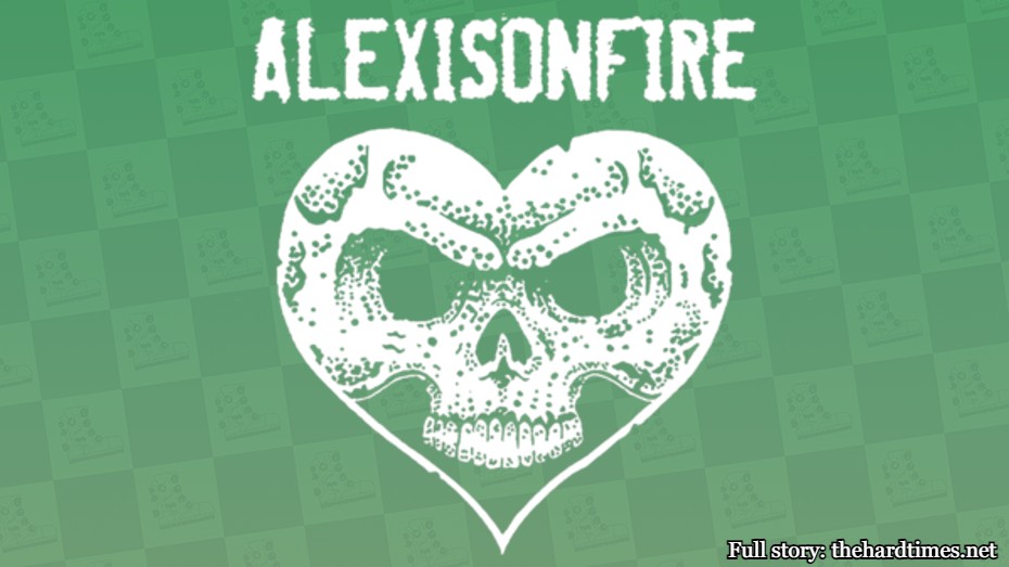
If you’re a band, there are only a few options to go with for your logo. You’re either doing a skull, a heart, or a heart and a skull at the same time. Starting to think they didn’t have any skulls laying around to paint in the Renaissance era. That’s a shame.
83. Death

A lot of band logo critics will tell you that Death’s emblem isn’t good. But I don’t get it. It’s got spiders, cobwebs, grim reapers, scythes, flames, and it’s dripping in blood. You have to know your audience with art. Who is the Mona Lisa for anyway, huh? Couldn’t even tell you.
82. Reel Big Fish
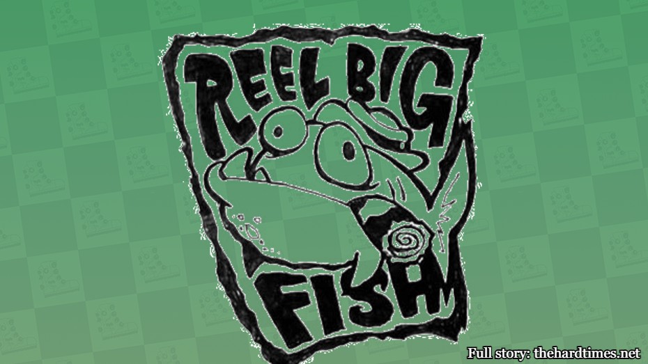 No one in the Renaissance era would ever think to paint a portrait of a cigar-smoking, bowler hat-wearing, underbite-clamping trout. Not saying ska-based art is better than Renaissance art, but I’m also not not saying it.
81. Mighty Mighty Bosstones

The Mighty Mighty Bosstones went with an angry bulldog as their logo. If I hadn’t known any better, I would’ve thought this was the logo of a beatdown hardcore band, not one from a group that wrote “The Impression That I Get.” But art truly comes alive with it subverts expectations.


