
60. Avenged Sevenfold
Hope you’re not sick of skulls yet. This one has bat wings though.
59. Abba

The Abba logo is easy on the eyes, and they were an early adopter of a backward letter in their logotype. Basically, Abba ran so Korn could walk. Truly the da Vinci of word-based band logos.
58. The Stone Roses
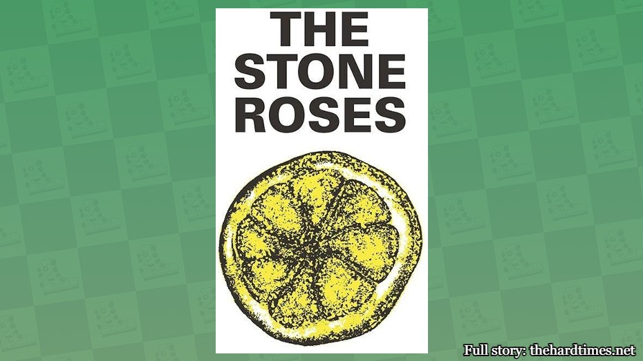
The Stone Roses logo is a sketch of a lemon. In the art world that’s called a still life, and that counts as artwork for some reason. We’re not here to argue. But it’s one of the best fruit-based band logos you’ll see.
57. Voivod

If it were hanging in a museum, you could spend a good hour in front of the Voivod logo staring at all the intricacies and using big words like “juxtaposition” and “cerebral” to impress the people around you. Thanks for making me sound smart in front of my friends, Voivod.
56. AC/DC
AC/DC is known for two things: A sick logo with a lightning bolt as a forward slash and a guitar player who wears a schoolboy outfit. Only one of these things aged well.
55. Buzzcocks

If you were tasked with designing the Buzzcocks logo, you wouldn’t think to just extend the first “Z” below the word and lengthen the second one above it. Sometimes simple is best. It took Michaelangelo four years to paint the Sistine Chapel. Should’ve just added some cool Z’s and called it a day.
54. Bauhaus
Bauhaus is one of the only bands that shares their name with a German art movement. The Bauhaus logo also has major Bauhaus vibes. It’s dark. It’s mysterious. But is it good? You just really can’t tell with art. Just like with the Mona Lisa.
53. Glassjaw

A lot of bands shy away from combining letters in their logos, but Glassjaw went against the grain to show the world what it would look like if the letters “G” and “J” birthed a deformed lowercase child. Taking risks in art can sometimes pay off.
52. Guns N’ Roses
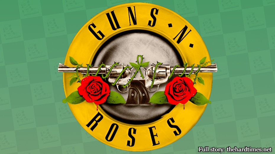
There were absolutely zero Renaissance paintings that depicted guns. Cowards.
51. Queens of the Stone Age
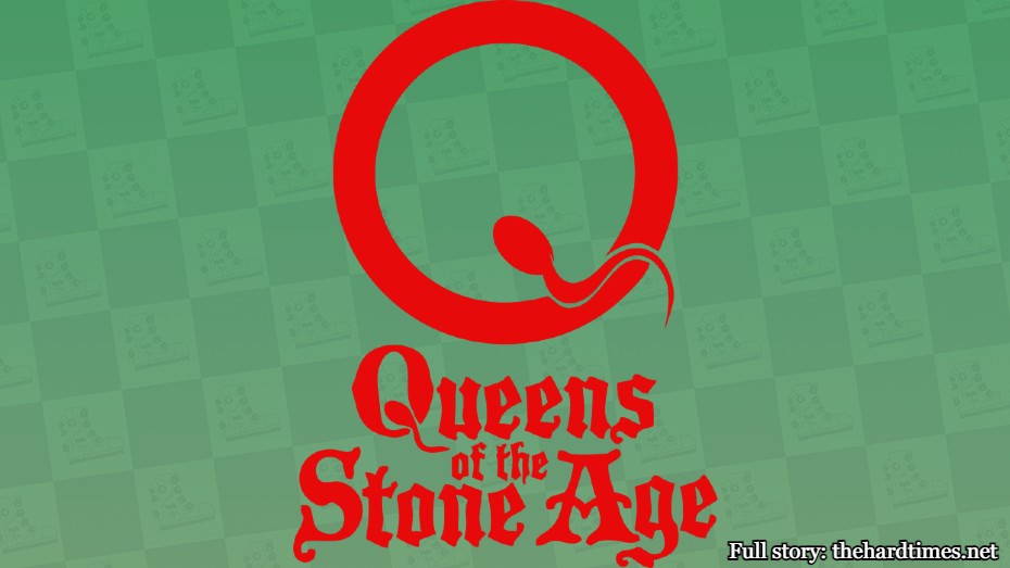
Sperm art was not so big in the Renaissance era. It wasn’t until QOTSA came around that they were able to pave the way for other reproductive fluid-based artists.
50. Pennywise

The PW logo is more recognizable than anyone in the band. That’s basically the same as Leonardo da Vinci. I know exactly what the Mona Lisa looks like, but I have no clue what he does nor will I ever seek it out on my own.
49. Weezer

Some might say that this is a rip-off of the Van Halen logo. That’s technically correct. But I’m sorry, David Lee Roth just cannot take claim on extra horizontal lines on letters. He just can’t.
48. Van Halen
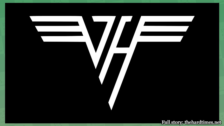
The classic winged VH logo is just a bunch of strategically placed lines. But then again, that’s what all art is. This one seems mathematically perfect though. It’s MC Escher adjacent.
47. New York Dolls
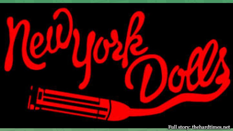
The New York Dolls logo perfectly captures the New York Dolls’ aesthetic. Sometimes that really heightens art. On the other hand, no one’s quite sure what the Mona Lisa is all about. Could be pro-fascism for all we know.
46. The Queers

The Queers emblem is just Felix the Cat doing a variety of punk-like things. There’s one where he’s wielding a knife, one where he’s the skull in skull and crossbones, and one where’s giving the middle finger. People like art when it’s blatantly stolen from other things. Don’t hide it like those Renaissance artists clearly did.
45. HIM

Him’s logo combines a heart and a pentagram. Also known as the “heartagram.” We’re going to deduct points for the name, but it’s not nearly as cringeworthy as calling your piece of art “Untitled.” At least HIM was able to commit to something.
44. Obituary
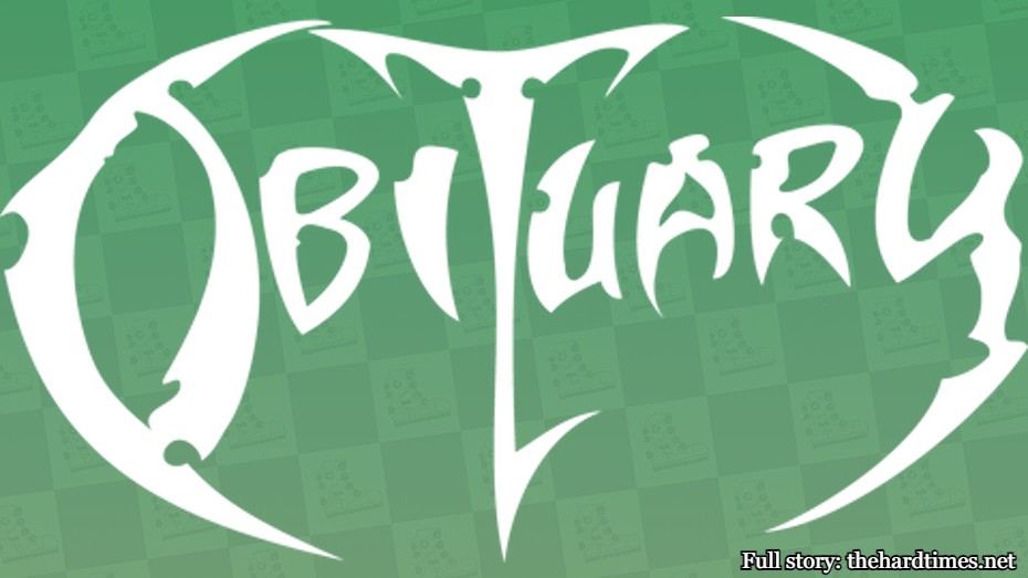
The Obituary logo is pointy with a lot of sharp ends. It really has to be for a band like this. Honestly, not enough Renaissance art has knives or things you can snag your belt loop on like this logo.
43. The Monkees

Who knew the word “Monkees” looked exactly like a guitar? This logo came to life thanks to lunchbox designer Nick LoBianco and would rank a whole lot lower if it were a bass. Dodged a bullet there.
42. Siouxsie and the Banshees

Siouxsie and the Banshees’ mysterious eyes logo is captivating in many ways. If you look at the eyes of the Mona Lisa, you’re not enraptured in the slightest. The Mona Lisa actually looks dead behind the eyes. Like a 16th-century serial killer.
41. Radiohead
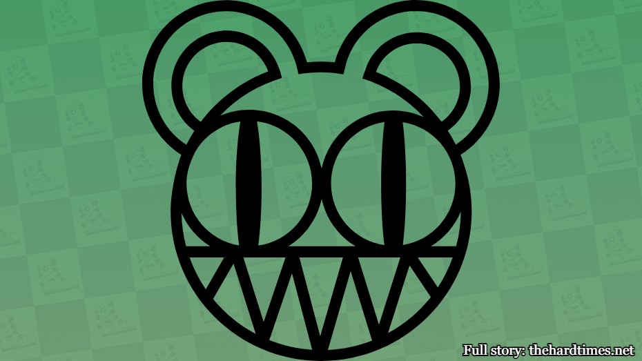
Radiohead’s logo doesn’t actually seem to fit the band. It’s a stylized bear that looks like it could be a logo for a startup tech company called Grzzly. It’s still cool as hell, but Radiohead should’ve gone with something like a dead tree with a raven perched on a branch or something.


