
80. Thursday

Thursday could’ve easily gone with a calendar as their logo. But they thankfully went with a dove instead. Doves are meant to symbolize peace. That’s what emo is all about, except towards ex-girlfriends.
79. Suicidal Tendencies

The Suicidal Tendencies logo is quite simple. But basic is sometimes good. Have you ever seen an old-ass painting? Nothing about it is simple. Looks like it took them years to complete just one portrait. Don’t make me think about how much work was put into your craft. It’ll make me feel bad.
78. Dillinger Escape Plan
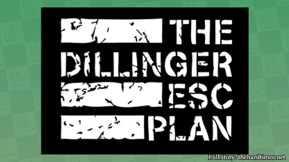
Flag artistry is an untapped form of visual design. In 5,000 years, we’re going to look back and see DEP as pioneers in the world of flag design. The same probably can’t be said about Renaissance art. But only time will tell.
77. Scissor Sisters
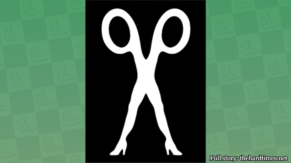
Scissors have never looked so hot. Nothing in the 15th century was sexy, especially their office supplies.
76. Skinless
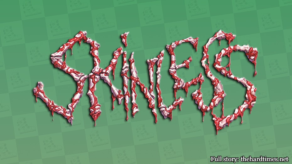
If we were ranking the grossest band logos of all time, Skinless would be top five. It’s like if a horror movie was a band logo. It’s incredibly effective. Way too much skin in Renaissance art.
75. Jawbreaker
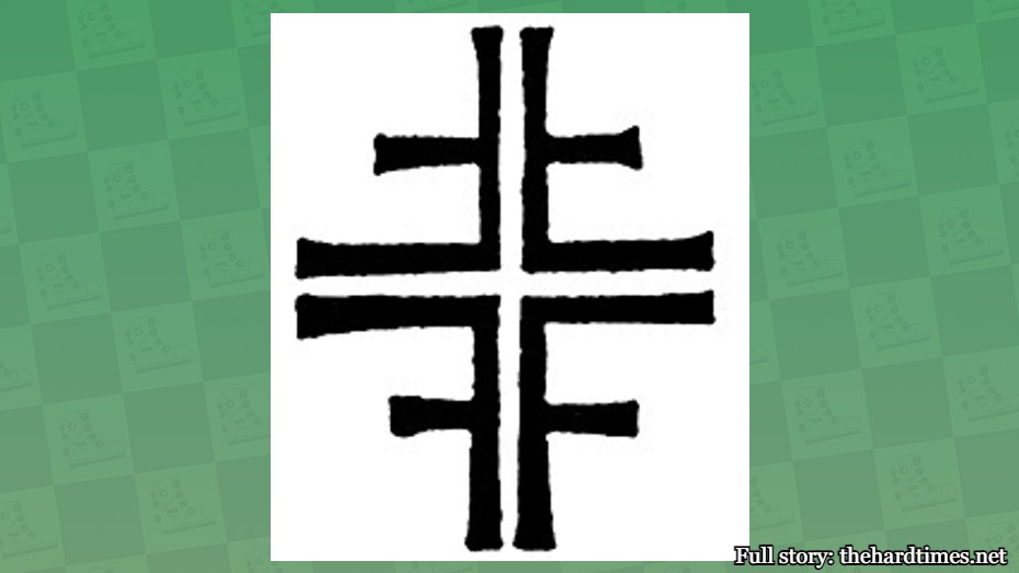
Jawbreaker’s famous “F” logo was repurposed from some guy who created it in 1846. Correct me if I’m wrong, but that’s the Renaissance period.
74. The Dickies
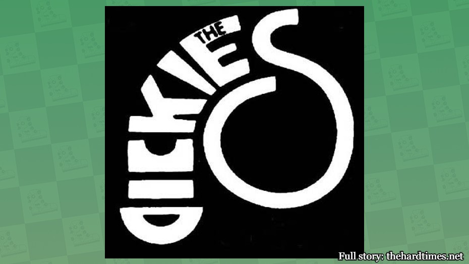
If you simply glance at this logo, you’ll miss the flaccid penis and testicles that are formed from the word “Dickies.” Renaissance paintings have a lot of limp penises in them too, but none of them go this hard. Very clever.
73. The Casualties

The Casualties logo looks like it was scribbled on a piece of paper at the last minute before their first show. But anyone can replicate it at home. I wouldn’t know where to start if I had to paint the Mona Lisa from scratch. The Casualties made things easy for us.
72. Ghost

The Ghost logo has a lot of twists and turns. You can follow it like a maze and find yourself getting lost in it for a good 20 minutes. That’s never once happened while staring at “The School of Athens” by Raphael, I assure you.
71. Mustard Plug
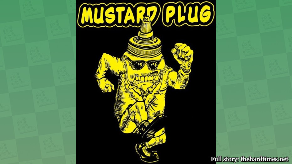
If you’re a ska band, you have to have an image of something skanking as your logo. That’s the rule. This band was forced to go with a skanking mustard bottle container. They kind of pinned themselves to a corner here. But art is all about pushing boundaries and looking at condiments in a new light.
70. Grateful Dead
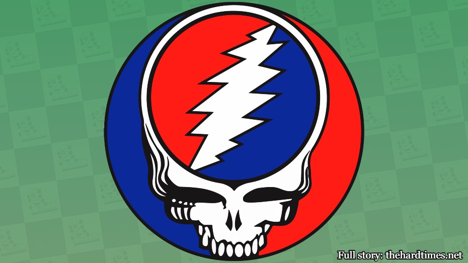
When I think of the Grateful Dead’s music I don’t envision skulls. That’s what metal bands do. But to be fair, there are almost no skulls in Renaissance art, so maybe the Dead was trying to make up for the failures of past art. Good on them.
69. The Bouncing Souls
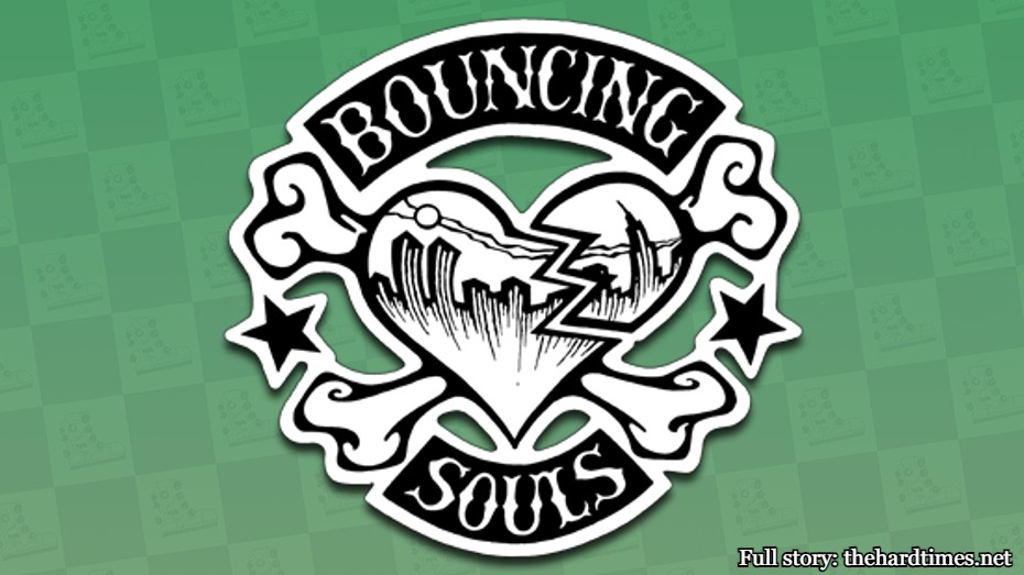
The Bouncing Souls logo is a refreshing take on the skull and crossbones one. If you look closely you can see that the heart is breaking. You can also see the Twin Towers in the background. No one has told the band about 9/11 yet. Please, let’s keep it that way.
68. Blitzkid
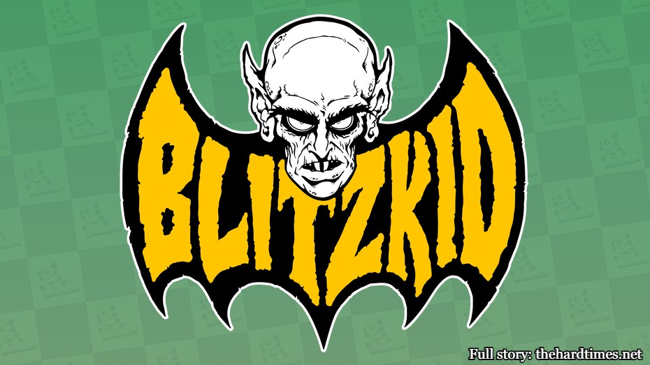
Not enough band logos and 16th-century art depict Nosferatu.
67. Cannibal Corpse
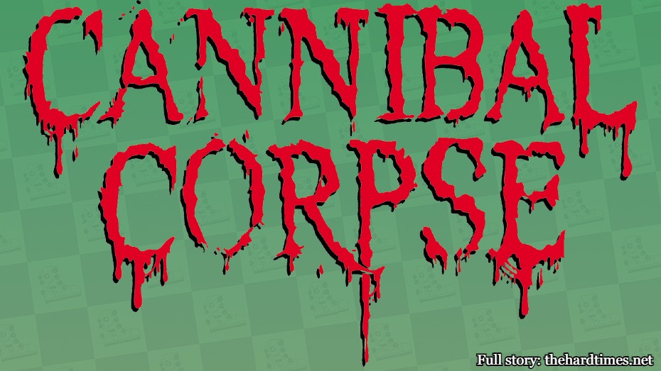
The Cannibal Corpse logo is perfectly succinct with their album covers. Say what you will about them, but Cannibal Corpse had a much more standout brand than da Vinci ever did. I couldn’t tell a Raphael from a Donatello, but we all know a Cannibal Corpse when we see one.
66. The Strokes
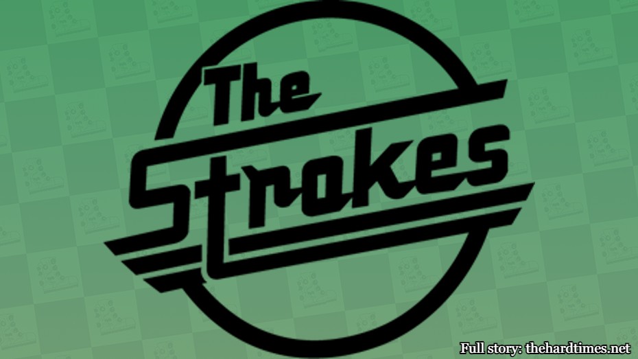
Surprisingly, a lot of logos from indie bands are quite underwhelming. The Strokes’ one is an exception though. It’s actually a spin on the Magna cigarette logo. Nothing says the Strokes more than defunct cigarette brands.
65. Mayhem
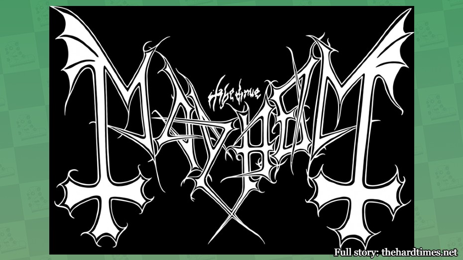
Oftentimes, the best band logos are the ones with unrecognizable words and letters. Sometimes I want to be confused when looking at art. I don’t just want to open my eyes and see the portrait of someone. Have a little fun with it.
64. Queen
The Queen logo is technically art, yet it also looks like it could be on a crest on a polo and no one would think anything of it. But if I walked into work with Sandro Botticelli’s “The Birth of Venus” on my shirt, I’d be asked to go home and not come back.
63. Anthrax
What do all metal band logos have in common? They all have pointy letters. It’s like how all Renaissance paintings pay close attention to detail and require a tremendous amount of time and effort. But still, not enough sharp edges in their work.
62. Anti-Nowhere League

A close look at this one reveals a fist, mace, chain, and spikes. Seems like something they would use in the 15th century as their go-to torturing device, yet I haven’t seen a single piece of art from this era that depicts one. Perhaps this logo is more Renaissance than most actual Renaissance ones.
61. The Dwarves

The Dwarves logo is known as the “skull and crossboners,” simply because that’s what it is. Modern art is all about penises depicted in imaginative ways. On the other hand, Michaelangelo’s David is showing hog, but there’s just not enough creativity in the penis-chiseling for my liking.


