
40. Converge
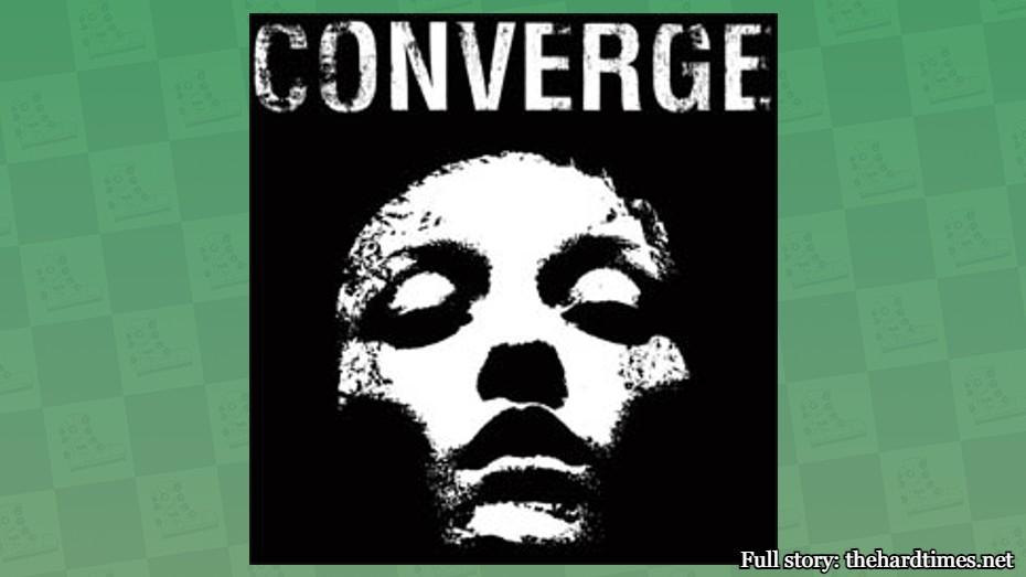
Converge’s logo first appeared on their album “Jane Doe” and it’s a stencil of French model Audrey Marnay. It’s essentially the 21st-century version of the Mona Lisa. But metalcore.
39. The Rolling Stones
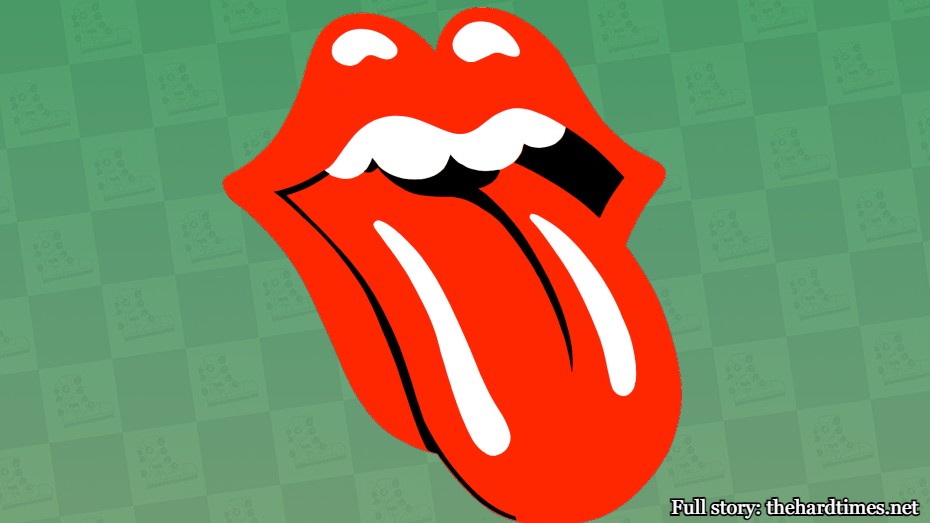
There isn’t a more iconic logo than the Stones’ one. The minute you see it, you know exactly what band it represents. Unless you’re under 30.
38. Run DMC
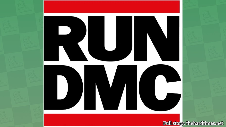
Run DMC’s logo is aesthetically pleasing and extremely balanced in nature. It’s like da Vinci’s “The Last Supper” but with less Jesus.
37. Korn
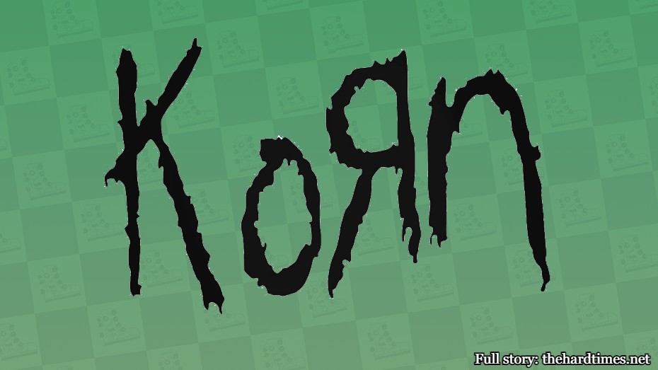
The Korn logo is famous for its backward “R” and misspelling of the word “corn.” It’s said that singer Jonathan Davis drew the logo using his left hand with a crayon. Back in the 15th century, you were guillotined for simply attempting to use your left hand for any reason. We’ve come a long way in art.
36. Youth of Today
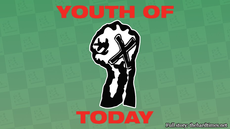
The Youth of Today logo encapsulates what every straight edge person loves: Writing an X on your hand and fisting. No band logo incorporates the essence of a movement quite like this one.
35. The Specials
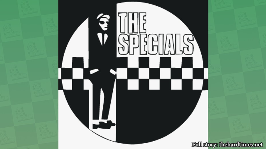
The Specials logo is of a guy named Walt Jabsco. And, you guessed it, he’s often seen skanking. The Specials also made the checkerboard pattern their thing. No one in the Renaissance era was brave enough to do that.
34. Iron Maiden
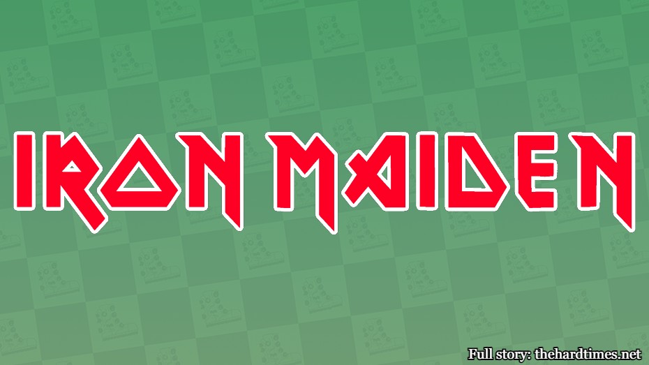
Iron Maiden is often associated with their Eddie the Head mascot, but their logotype is just as sick. Just once I’d like to walk into a museum and see descriptions for paintings using letters that look this cool. Until then, I’ll continue to avoid reading anything about art.
33. Cattle Decapitation
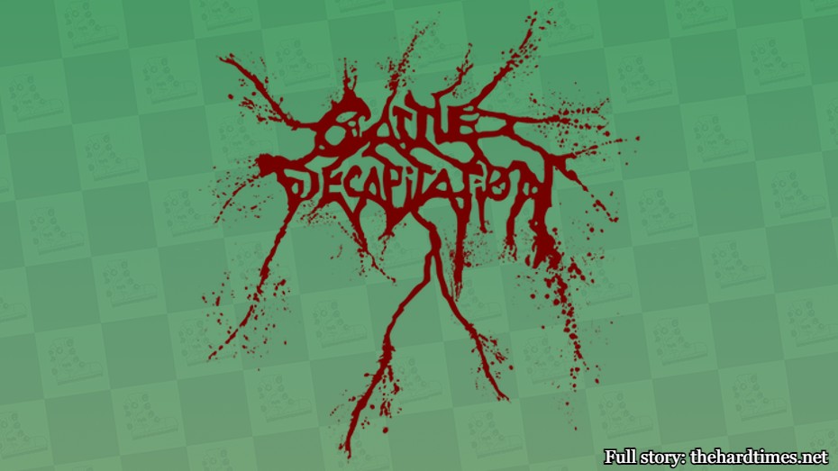
You can’t call yourself Cattle Decapitation and not have an absolutely brutal logo that goes along with it. It’s somehow equally as unnerving as that famous Francisco Goya painting “Saturn Devouring His Son,” which would also be a sick band logo of its own. But instead it’s wasted as a painting.
32. Madball
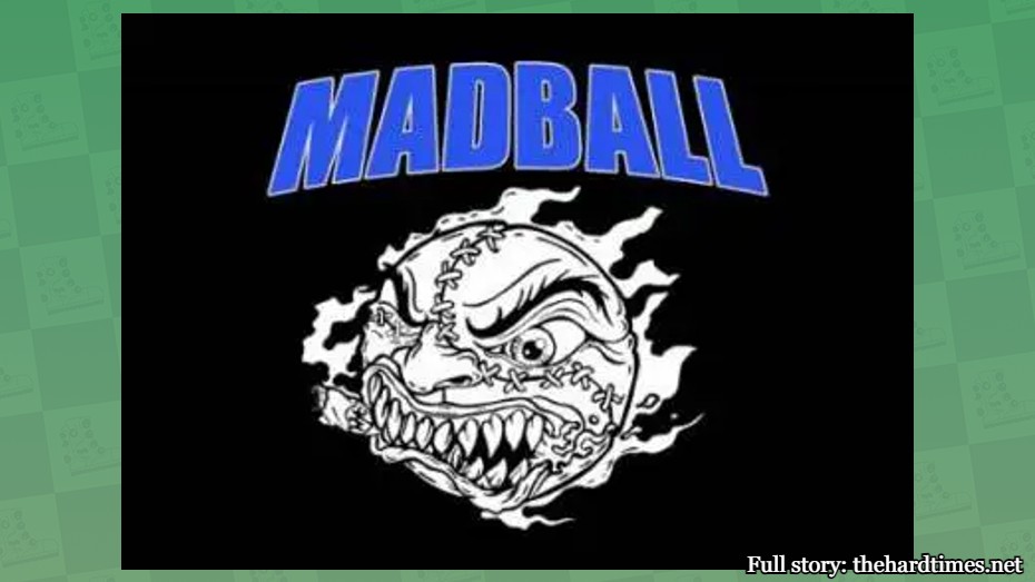
Madball has the only logo that would work equally well for a double-A baseball team as it would for a New York hardcore band. Some might say that’s not art, but then again some would say Jackson Pollock’s work is. Those people can’t be trusted.
31. Death From Above 1979

Ever see that one Renaissance painting where two guys had elephant trunks instead of noses? That’s because one doesn’t exist. No one in the 15th century had imagination. That didn’t evolve for another 5,000 years when bands started creating logos.
30. Sex Pistols
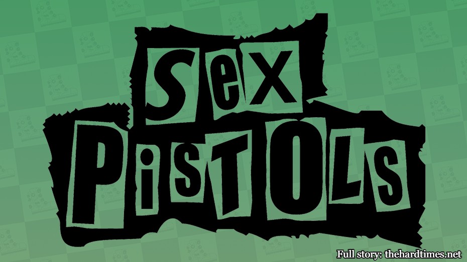
The Sex Pistols logo was created by British artist Jamie Reid. It’s meant to look like a ransom note with different juxtaposed typefaces. Nonetheless, it’s extremely punk. There are almost no instances of cool-looking letters in Renaissance art. It’s almost like they couldn’t read.
29. Judas Priest
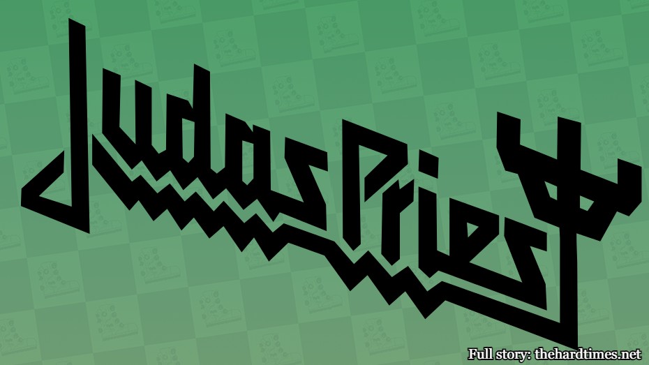
Sometimes it takes a couple of albums before a band really hits their stride with a logo that sticks. That’s exactly what happened with Judas Priest. The “T” appears to be some sort of badass cross. Some say it’s an Egyptian glyph. But like all old art, no one knows what the fuck it means.
28. Run the Jewels
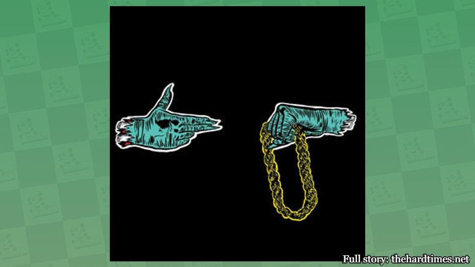
The RTJ logo is simply two hands meant to represent a robbery in progress. It’s so sick that they had to put it on all of their album covers to date, including that remix one called “Meow the Jewels” where the hands are turned into paws. Eventually, all art is repurposed with cat-like features, including the Mona Lisa.
27. The Cramps
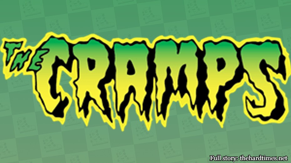
The Cramps logo somehow looks like what the band sounds like. You can almost hear the spooky guitar riffs coming through the lettering. I don’t hear anything when I’m at a museum except for the security guard yelling at me to stop throwing tomato soup at the Van Gogh.
26. Nirvana
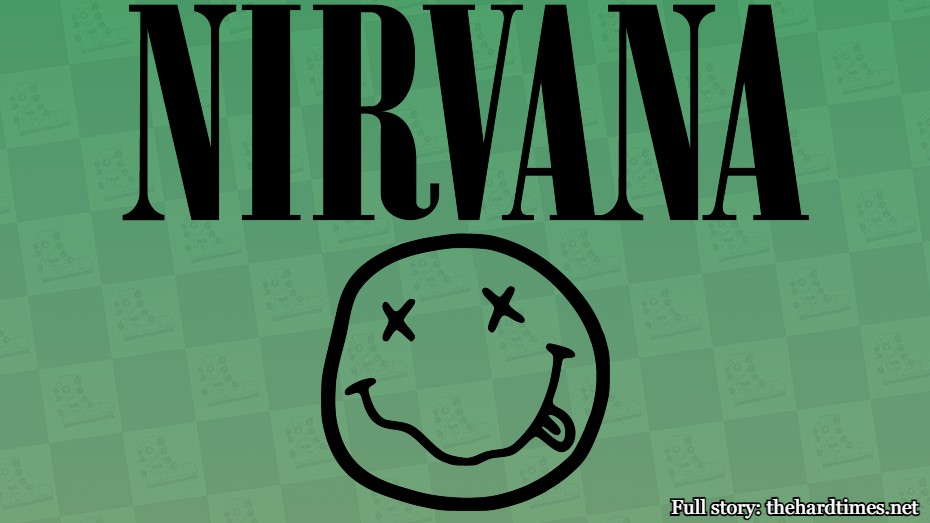
The Nirvana smiley face logo has been repurposed so much for parody merchandise that it’s made a ton of money for a lot of people. It’s like that one Joy Division album cover. That being said, I haven’t made a single penny on my parody Georgia O’Keeffe merch.
25. Emerson, Lake, and Palmer

The famous ELP logo was designed by Swiss artist HR Giger. This guy also invented the Xenomoprth from the movie “Alien” (1979). Show me a Renaissance painter that could create a logo for a progressive rock band as well as a hostile double-mouthed alien that’s always wet. You can’t.
24. Operation Ivy
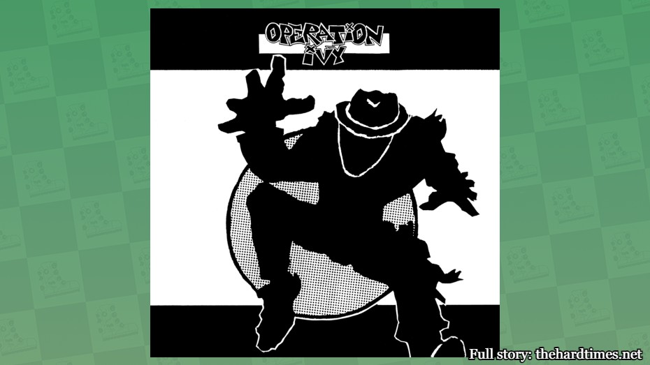
You simply cannot do a band logo ranking without including Ska Man. Lead singer Jesse Michaels created the legendary mascot. He also drew the elaborate album cover for “Energy,” which makes me think he’s too busy focusing on his art to reunite Op Ivy. No, Jesse. NO!
23. The Dead Milkmen
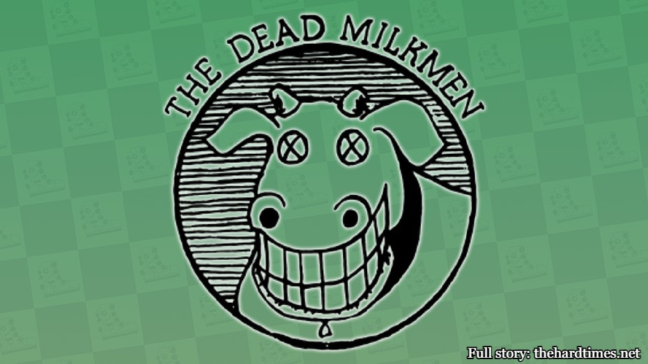
The Dead Milkmen’s logo appears to be a dead cow with a shit-eating grin on its face. This may look simple on the surface, but you have to remember that everyone in the early ‘80s was into “The Far Side” comic strips, which is as high of art as you’re going to get in that decade.
22. Social Distortion
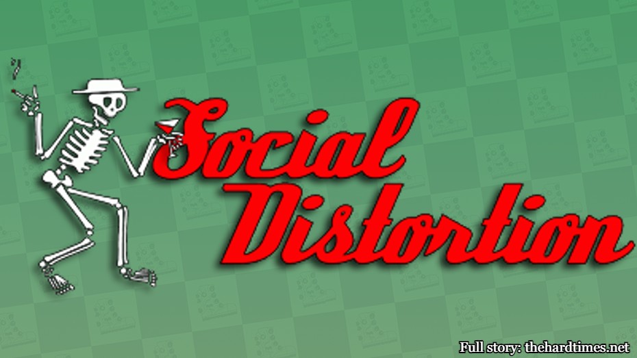
Social D’s legendary “Skelly” logo was designed by Mackie Osborne in 1983. You can see its likeness on t-shirts, action figures, and food trucks. That means it’s versatile. More so than anything Gustav Klimt ever did.
21. The Adicts
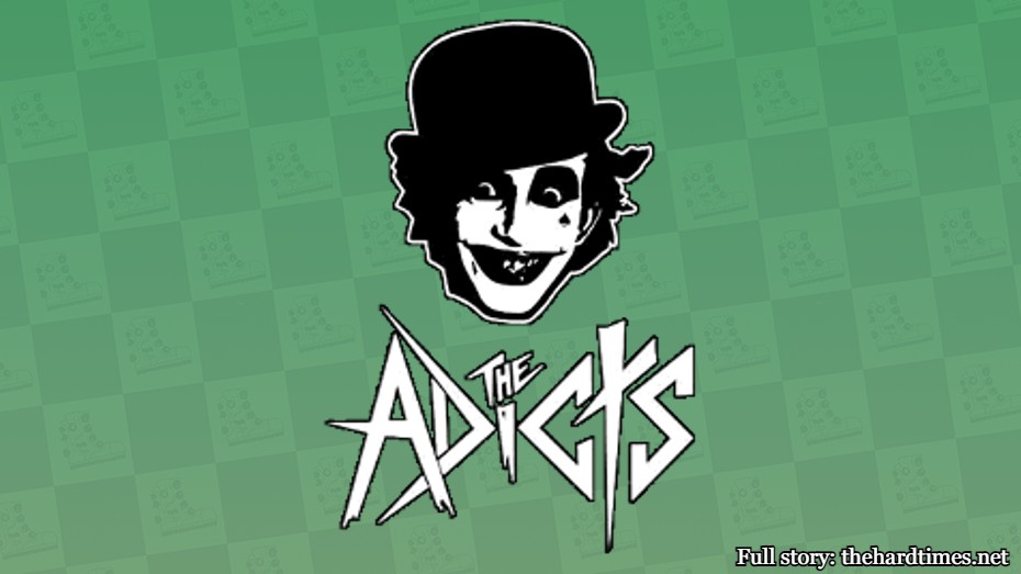
There are absolutely zero Renaissance-era portraits where the subject is smiling. Nobody was happy because there weren’t any punk bands in the 16th century. That’s why the Adicts logo is refreshing.


